

Got 30 seconds?
The problem
Astroverse 1.0 was a swipe app with an astrology score bolted on. People dropped off before they saw a profile, swiped without matching, couldn't read their Kundli score, and had nothing to do once the day's profiles ran out.
What I did
I rebuilt it around one idea: help someone decide about one person, not scroll past fifty. Verification moved to the moment of contact, Discover became 3 handpicked profiles a day, the Kundli got plain words, and Veda, an AI astrologer, gave people a reason to return.
- 26K+
- Kundli profiles created
- ~88%
- of people who start onboarding finish their Kundli profile
- 23→38%
- share of Discover decisions that are likes
- 11K+
- questions asked to Veda in its first 3 months
Where we started
A swipe app wearing a Kundli
Astroverse is a dating app for Indian millennials and Gen Z who are dating with marriage in mind. It matches people on the 36-point Guna Milan from their birth charts, the same compatibility check many families already trust.
Version 1.0 followed the Western swipe playbook: an endless feed, a heavy onboarding wall and a compatibility score nobody explained. Usage looked busy, but it wasn't turning into matches or conversations.
North star for 2.0: fewer profiles, better matches. Every screen should help someone make one good decision.
01Switchback · Verification wall
People left before they saw a single profile
In 1.0, face liveness, KYC and a Kundli animation all came before the first profile. Most onboarding drop-off happened at those steps.
InsightTrust matters at the moment of contact, not at the door. People verify once there's someone worth verifying for.
Move verification out of onboarding
New users reach real profiles first, so they see the value before we ask for effort.
Why it mattered: the steps that lost people were no longer between them and the product.
Ask after 3 likes or comments
The prompt appears when someone is already interested in a person, framed as "get seen by trusted profiles", not "prove you're human".
Why it mattered: the request arrives when the reason to say yes is on screen.
Lock chat until both people are verified
Nobody can message you without proving they're real, which keeps the safety promise without blocking browsing.
Why it mattered: trust is guaranteed where it counts, in conversation.
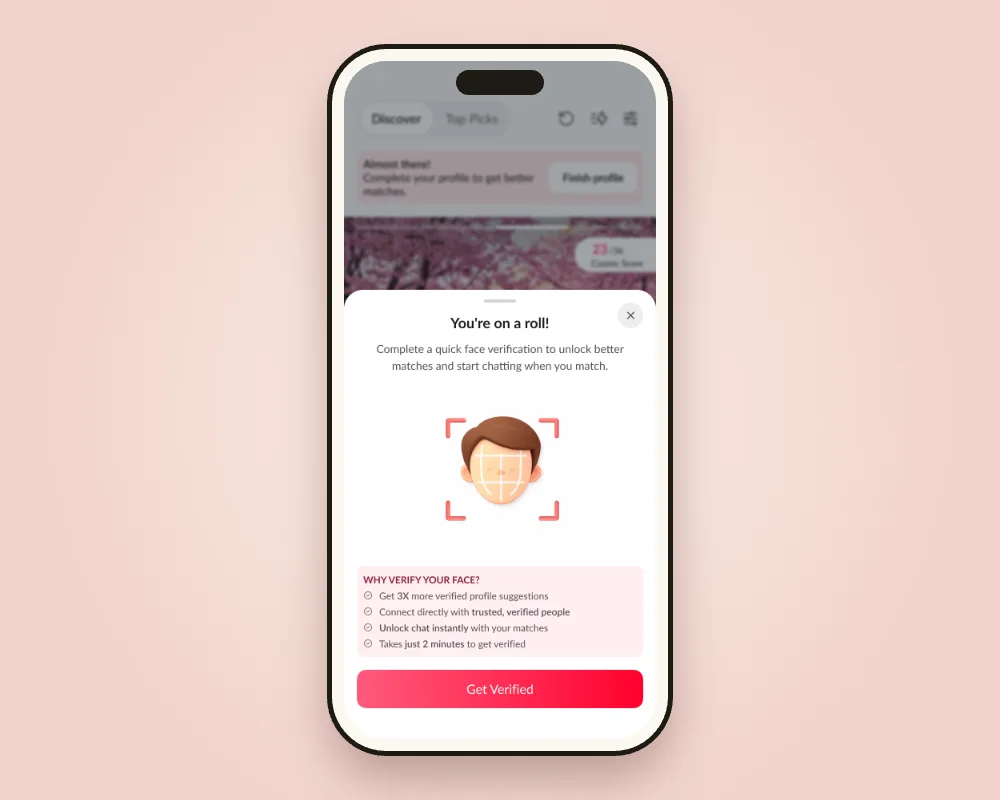
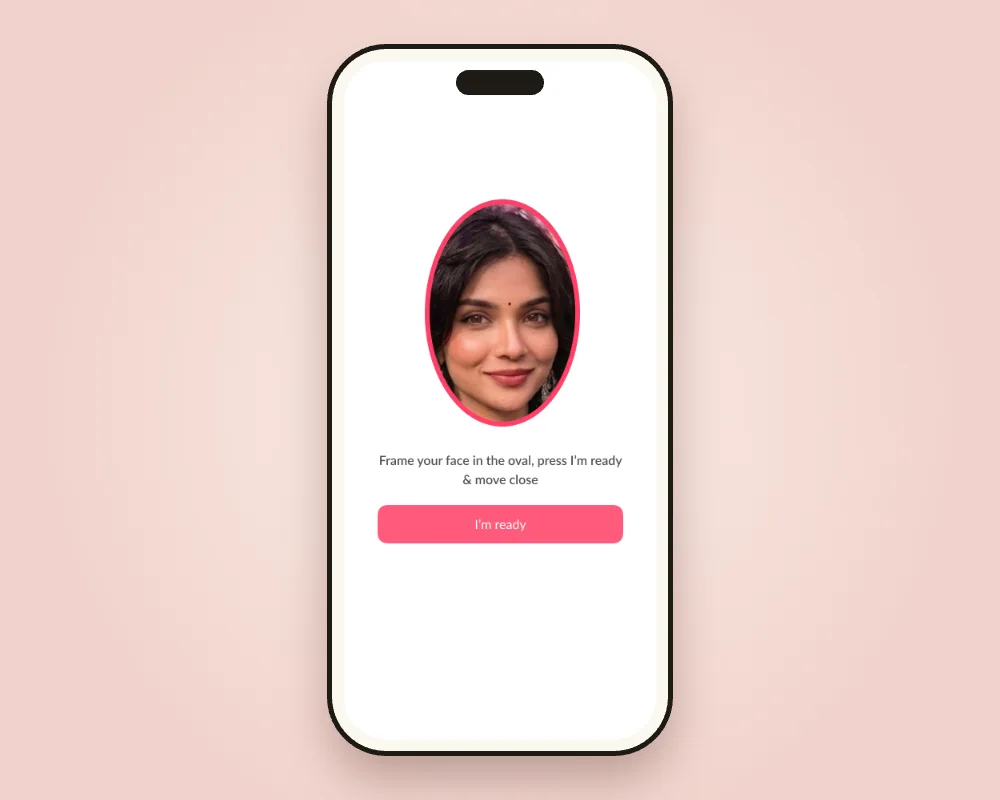
Result~88% of people who start onboarding now finish their Kundli profile, and 6,100+ users are face-verified.
02Switchback · Endless swiping
Lots of swiping, almost no matches
With an unlimited feed, people disliked 3.4 profiles for every one they liked. Every profile felt disposable, and most matches came from people who had already liked you.
InsightA short, high-compatibility list respects everyone's time, and showing who's already interested turns browsing into a decision.
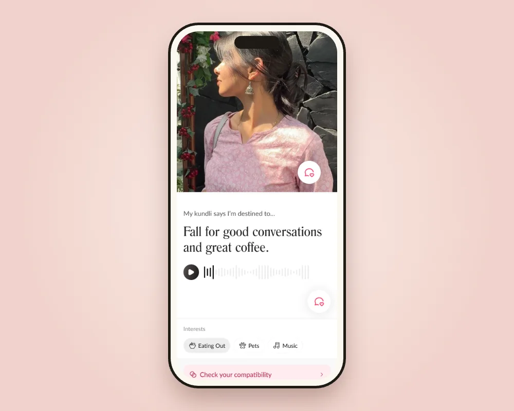
3 handpicked profiles a day
8 on Pro, ranked by Guna score and stated preferences instead of recency.
Why it mattered: scarcity made each profile worth a proper look.
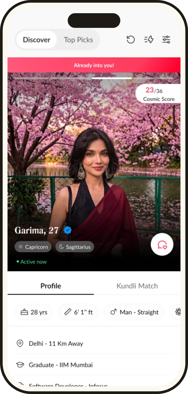
An "Already into you" tag
Profiles of people who liked you first are marked in the feed.
Why it mattered: it surfaces the likeliest matches at the moment of choice.
Weekly Top Picks
A small, high-compatibility set refreshed every week, announced at the app's evening peak.
Why it mattered: a reason to come back that isn't another swipe.
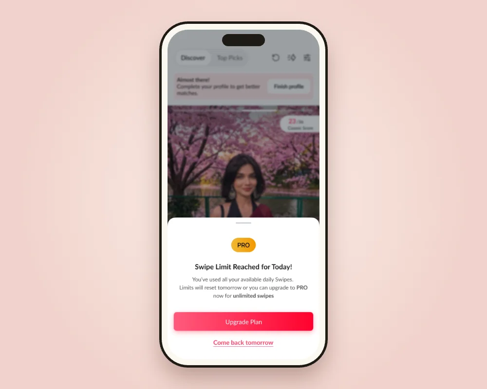
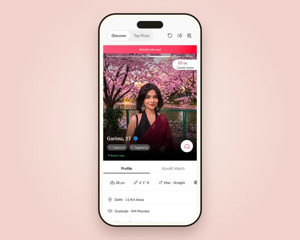
ResultLikes rose from 23% to 38% of Discover decisions, and about 4 in 5 active users open Top Picks.
03Switchback · Unreadable Kundli
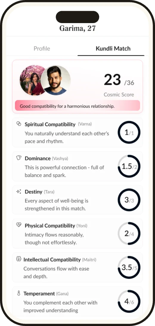
A score nobody could read
Every profile showed "23/36" and eight Sanskrit terms. Most people stopped reading after the second row.
InsightPeople trust astrology when it explains them, not when it grades them. And their own deal-breakers still matter.
A plain-language line for every Guna
Each of the 8 Gunas says what it means for the two of you in one sentence.
Why it mattered: the score became a conversation starter, not a verdict.
A tappable chart
Each part of the chart opens its own explanation, so curious people can go deeper.
Why it mattered: depth on demand, without a wall of text.
Preference Compatibility % next to the Guna score
A second number for the preferences people set themselves.
Why it mattered: it respects both the stars and the person.
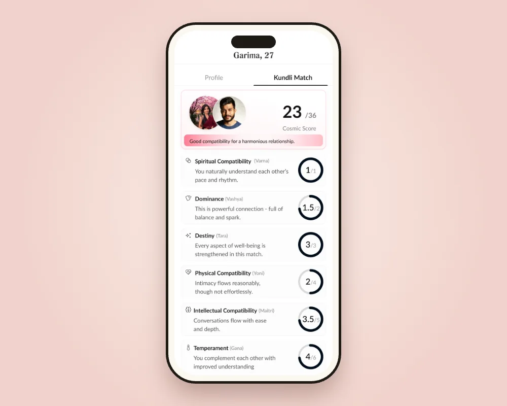
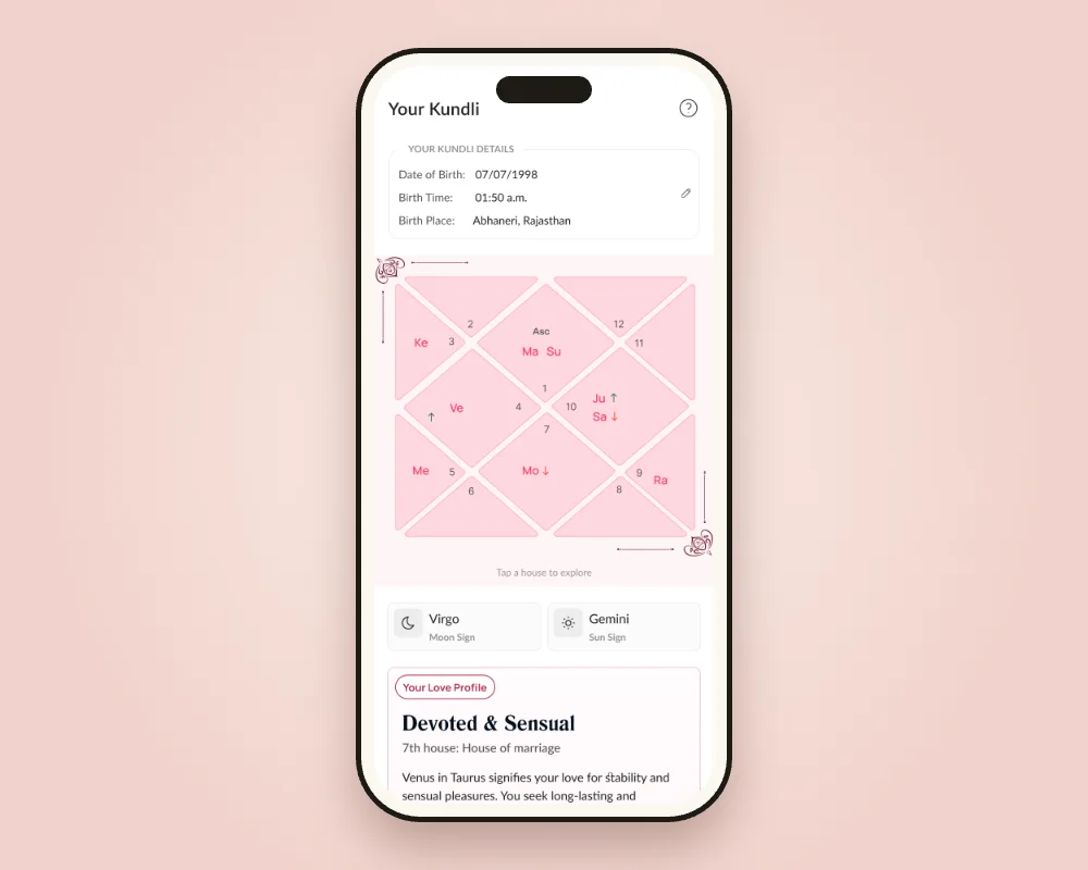
ResultAbout as many people open the Kundli tab each month as open Home. Preference match now ranks Pro Discover.
04Switchback · Empty days
Nothing to do after today's picks
Limiting Discover created empty days. Once the day's profiles were gone, people had no reason to stay.
InsightIf you limit the core loop, give people a second reason to open the app, ideally one that pays for itself.
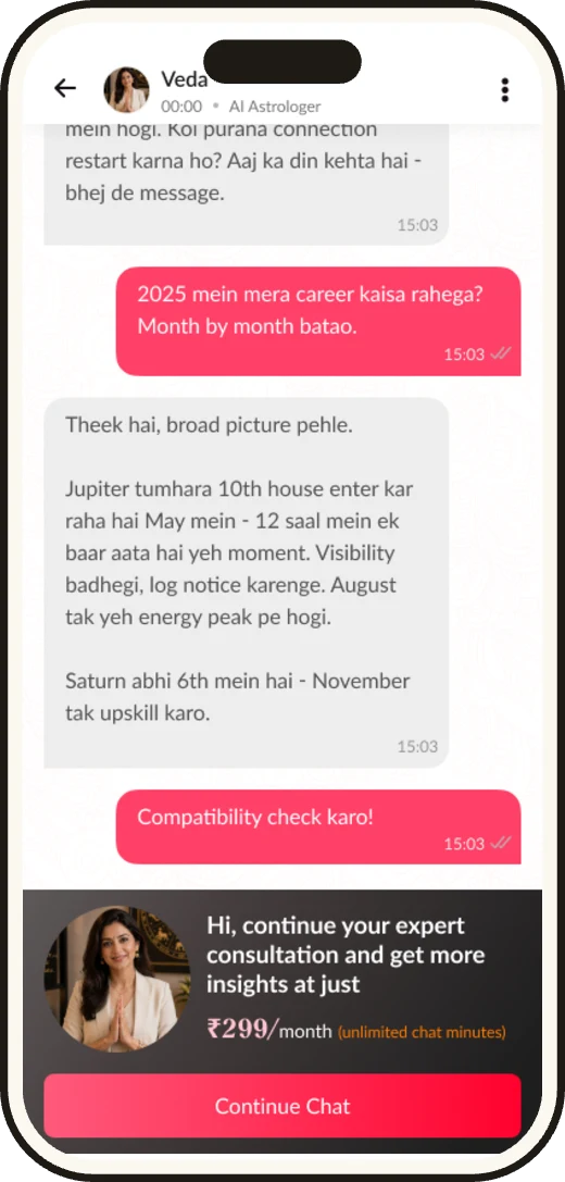
Veda, an AI astrologer
Answers questions from the user's own Kundli, in a warm Hinglish voice. I designed the conversation UX, session logic and the system prompt.
Why it mattered: it extends the core belief of the app instead of adding a random feature.
Love life free, other topics paid
Questions about love life stay free; questions on other topics are paid.
Why it mattered: the free part feeds dating; the paid part funds it.
A pricing A/B test: time vs questions
Two ways to charge for a session, tested before committing to one.
Why it mattered: we let behaviour pick the model, not opinions.
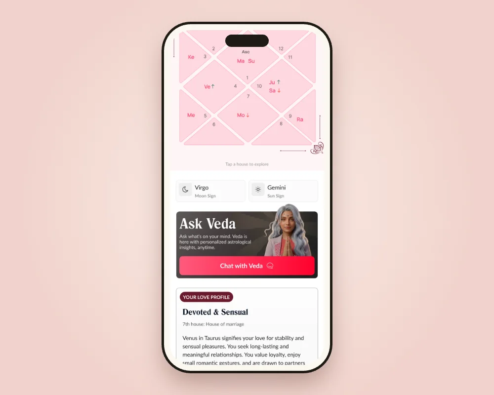
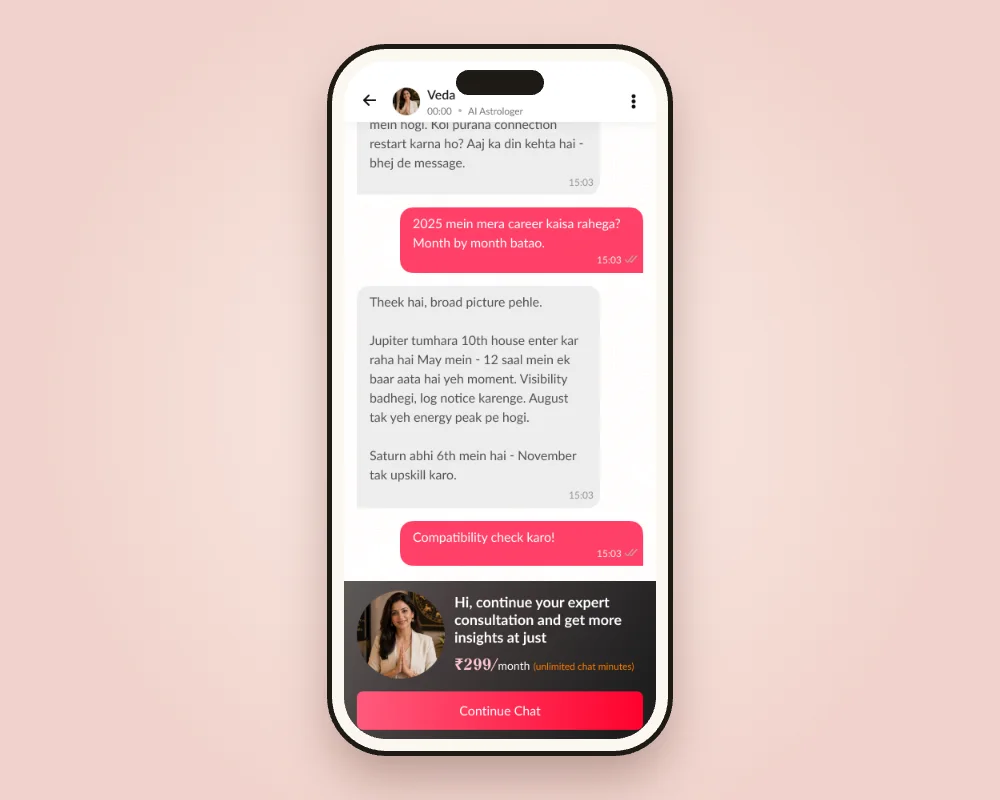
Result2,200+ users asked Veda 11K+ questions in its first 3 months.
Results
Where the climb landed
- 26K+
- Kundli profiles created
- ~88%
- onboarding completion
- 6,100+
- face-verified users
- 23→38%
- likes share in Discover
- ~4 in 5
- active users open Top Picks
- 11K+
- Veda questions in 3 months
Source: Mixpanel, tracked since Nov 2025.
What I learned
Notes from the trail
- Constraints create intent. Limits made each profile feel worth a real decision.
- Ask for effort when the reason is on screen. Verification worked once it was tied to a person, not a form.
- Explain, don't grade. Astrology earns trust when it says something about you.
- If you limit the core loop, add a second one. Veda filled the empty days and opened a revenue line.